
NCR: from rebel startup to no-code agency

The leading agency in custom no-code software development.
About the project
For over a year I shaped the brand of NCR (No Code Rebels), a no-code development startup. Its idea is simple: no-code gives small businesses a fast, affordable way to launch, and lets large companies test hypotheses without big teams of developers and designers.
Over that year the brand went through two stages: a loud startup identity, and then a calmer, more mature one for a growing development agency.
Stage 1 · Idea
First logo
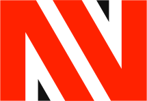
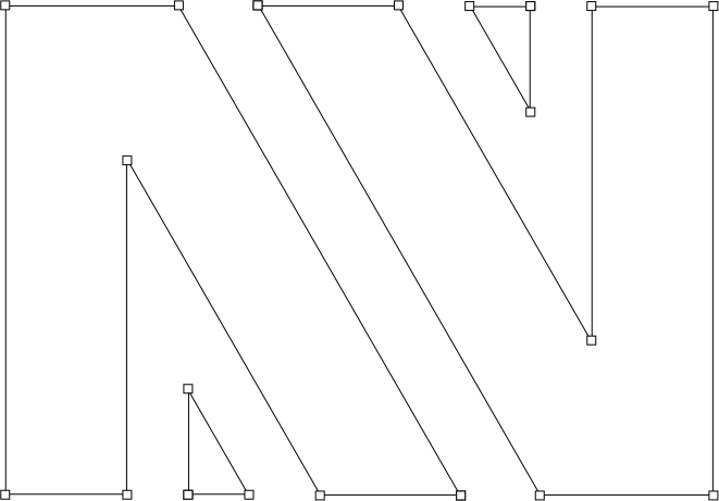
The first logo puts the letter N inside a rectangle: a nod to the block-based nature of no-code platforms, where products are assembled from ready pieces.
A rebellious orange accent stands for innovation and energy, and a clean white background for clarity and simplicity, the core of the no-code idea.
Brand book
The brand book for the first logo is bright and airy. It sets the rules for type, colour, imagery and layouts so the brand looks the same in decks, on the first website and in social media.
Then the brand got a dark mode: the same grid, type and orange accent turned into a dark version for presentations and screens. Flip the switch to compare.


Stage 2 · Growth
From rebel to builder
As NCR grew from a startup into an agency, the logo had to grow with it. The N lost the sharp slashes, went through a line sketch and settled into a solid block shape: steadier, more confident and still recognisable.
Meet the new NCR


Logo and strategy
A bold, adaptable mark that signals reliability and professionalism. Its versatility is the base for everything that follows, and a detailed brand book keeps every touchpoint consistent.
Identity system
The logo became a building block for the whole visual language: repeated N patterns and flowing line waves stand for the company's dynamic approach to development projects.
Website on Webflow
The identity came to life on a website built in Webflow. The focus was clear UX and a consistent UI with the dynamic brand elements woven in.
Webflow keeps the site fast on every device and lets the team update it without developers, which is exactly what a no-code agency should show.

Result
Two brand generations in one year: from a loud startup logo to a mature identity, a brand book with light and dark modes, and a website that shows the agency's expertise. Together they reflect NCR's values of professionalism, innovation and focus on clients.