


Eat Florist: a brand for edible gifts
Creating a distinctive brand image for an edible bouquets business.
Objective
As the edible gifts business expanded, it needed a distinct and recognisable image. It started out on the founder's personal brand, but with a dedicated team on board the company needed a fresh identity of its own.
Conceptualisation
The main challenge was a wide audience, from serious, older customers to a younger crowd. The answer was a colour scheme built on contrast: light, pinkish hues for younger customers and deep maroon tones for the older segment.
Brand guidelines
A complete set of brand guidelines keeps everything consistent and makes future products easier to design. It captures the essence of the new identity in one place.

Typography
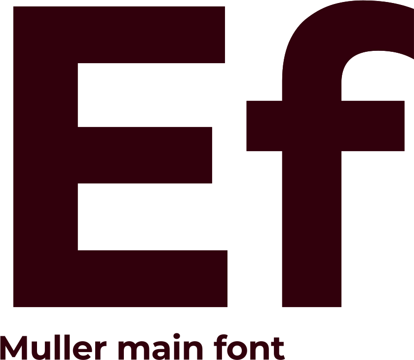
Fonts were picked to match the brand's character. Muller won over the more rigid Montserrat: its tight letter spacing keeps it strict, while its shapes stay soft.
Website
Instagram was the main sales channel at first, so the brand needed a wider reach. An online catalogue came first, paving the way to a full e-commerce store. The design keeps choices simple and contact quick, and leaves room to grow into a real sales tool.


With so many sales coming from Instagram, its look had to be refined. Research and experiments showed graphic posts were losing engagement, so the focus moved to a consistent photo style. A fixed backdrop and lighting setup, documented in the brand guidelines, lets anyone on the team shoot good photos for posts.
Distinctive print materials make every gift recognisable and give each item the brand's own stamp.

Animation
For big promotions and events I made custom posts, mostly 2D animation with a few 3D experiments, to grow reach and engagement.
Results
Within three months of the rebrand and marketing work: